Carrot Component Library for Paxos
Its your asset, and you need it now!
An asset and interface library for the leader in regulated blockchain products.
During my three years at Paxos, I oversaw the small-but-mighty three-person product design team in charge of the user interface and experience design of all of Paxos’ internal tools and products. While I touched a wide variety of surface areas, most of which I cannot share publicly, I'm most proud of our design system and internal asset library: Carrot.
The Challenge
As we were a small design team working on an enormous breadth of products, we needed solutions that allowed us to have maximum impact across the entire organization at once. At the same time, we needed to unify the experience and aesthetic of an entire suite of products being packaged as a single solution.
Defining Success
We settled on crafting a modular design and template system that, given limited front-end resources, had the potential to vastly reduce development time and improve adherence to user experience and branding best-practices.
To Engineers:
Our in-house engineers were in need of a system that is both fast-to-implement and flexible enough to accommodate future features and use-cases. The ability to draft a UI to ~90% completion without design input would remove blocks that had previously caused delays.
To Internal Users:
Internal operations members needed an expected, seamless interface and experience from one section of the app to another to accomplish their job efficiently and effectively.
Our Solution
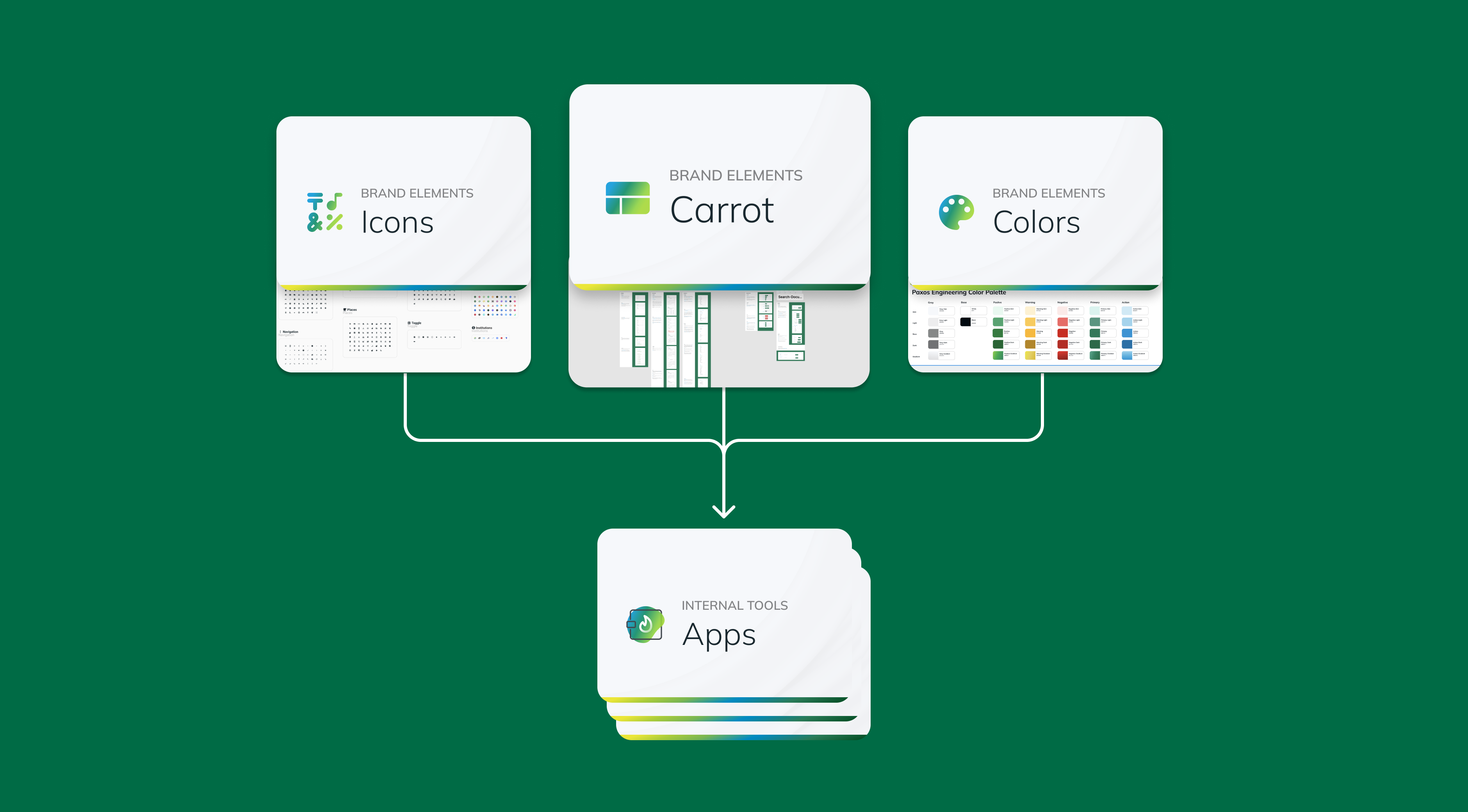
To solve our bandwidth woes, we created Carrot: an internal modular component library built in React on top of Material UI. This would function in tandem with our eng color library and icon library to be the base of the Paxos internal design system.
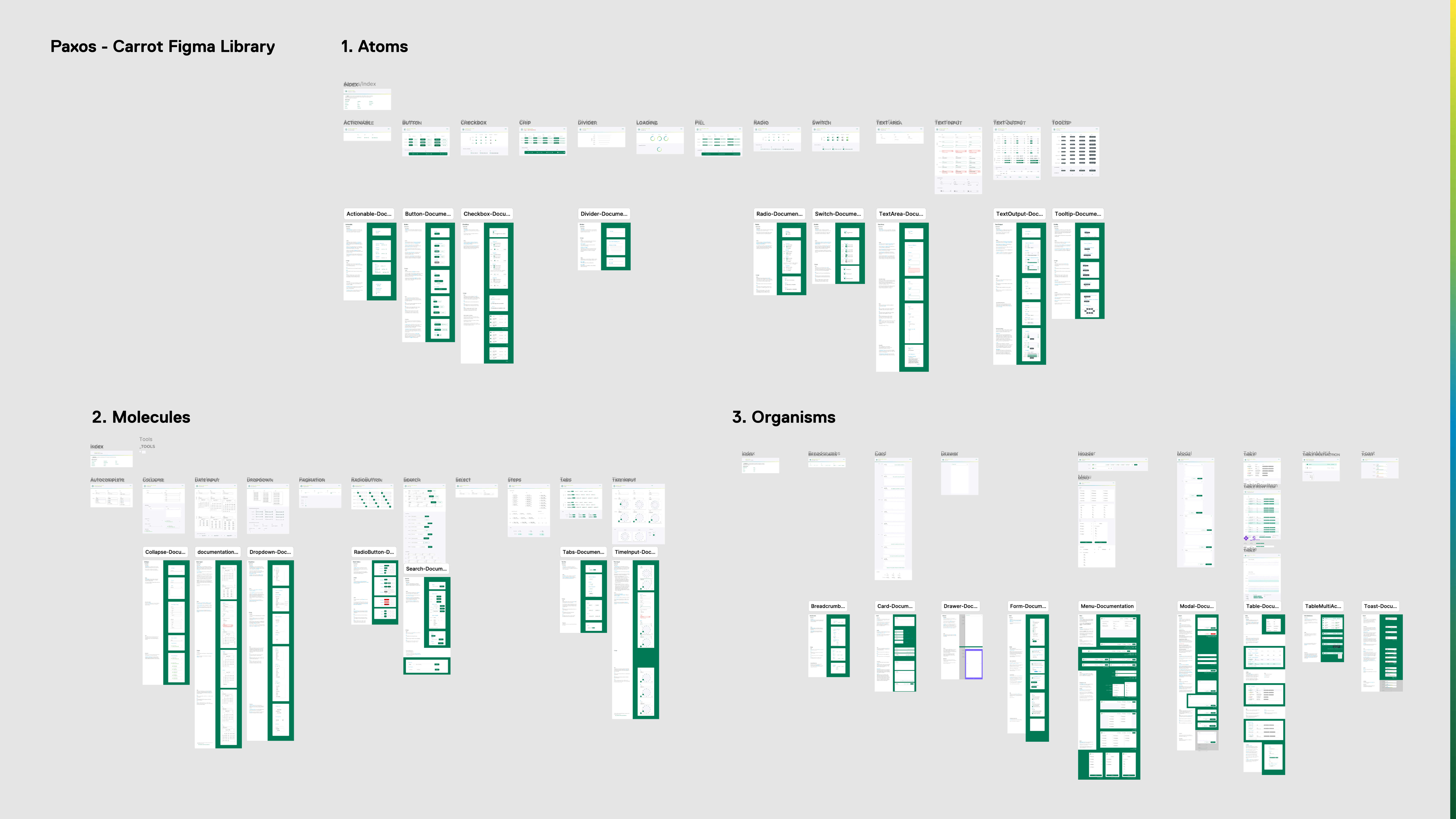
By utilizing an existing library, we were able to quickly jumpstart creation and adoption. Base components used the atomic design methodology and consisted of everything from atoms (buttons, actionables, etc.) to organisms (tables, cards, etc.).
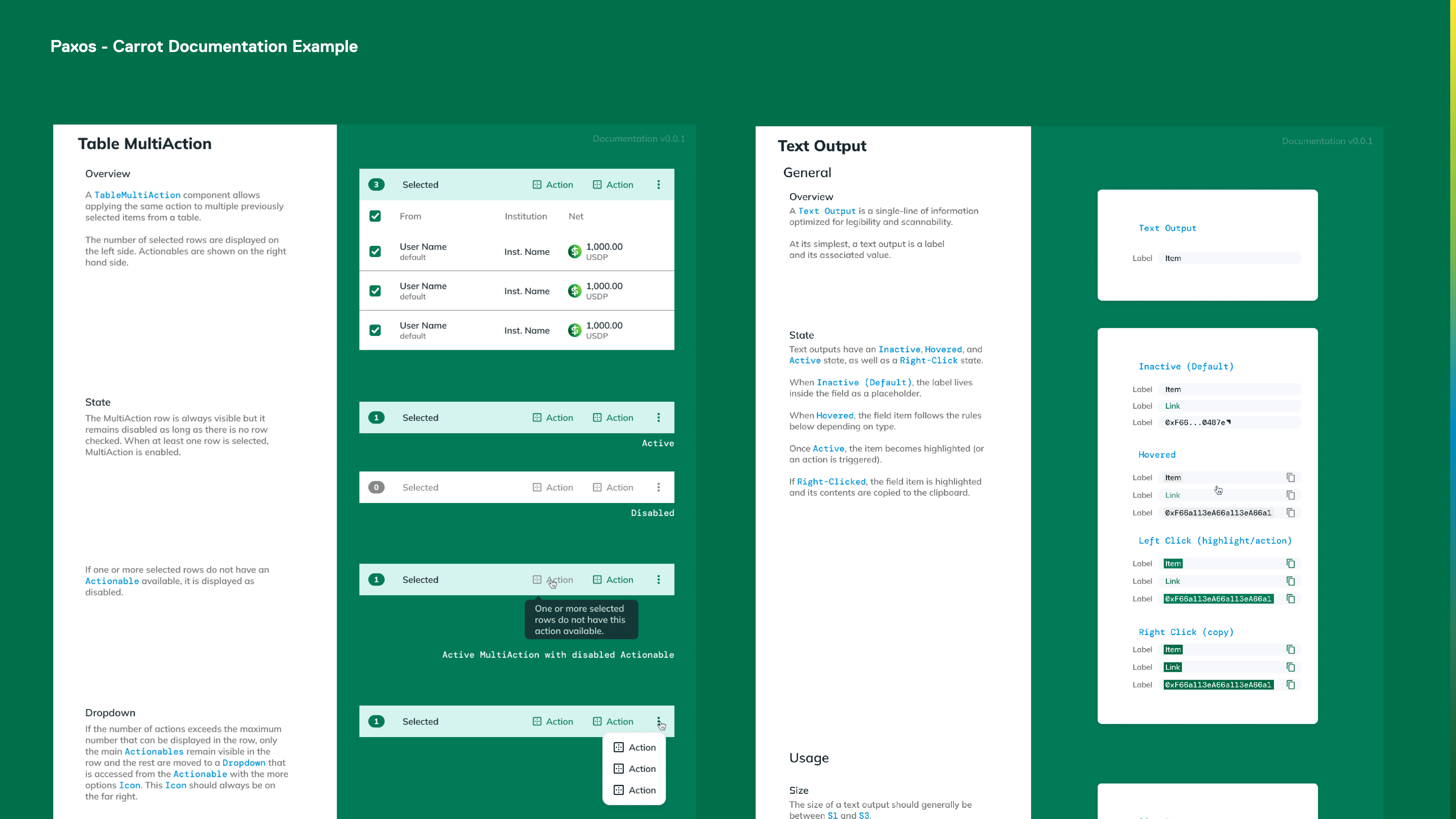
We created an accompanying documentation file in Figma and Storybook to allow engineers to understand component best practices, greatly reducing the need for design support until final implementation.
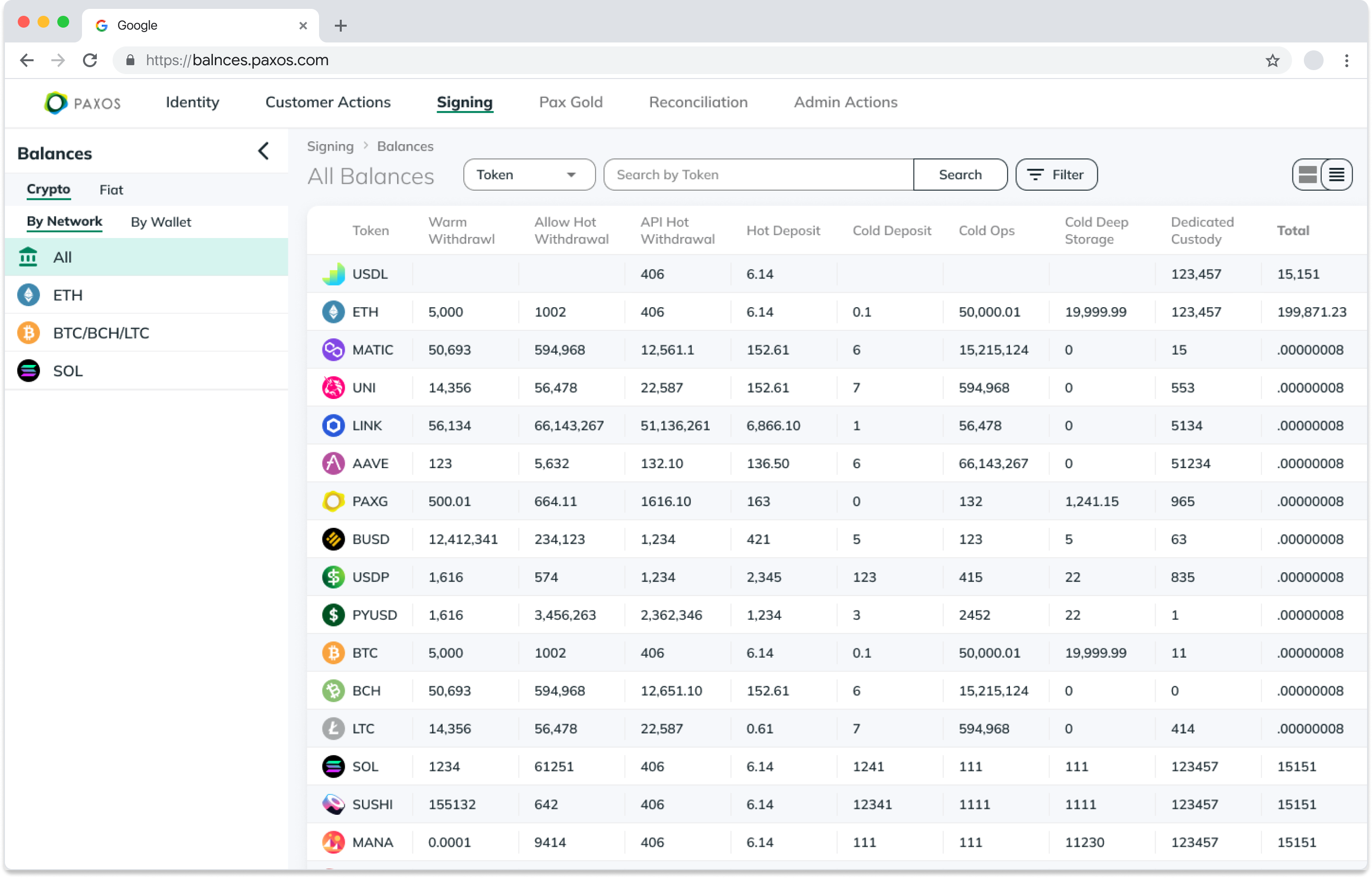
Animal-level components were built on top of the base components to create a template system for everything from list views to balance pages. With three modular page templates: list view, detail view, balance view, we accounted for 95% of the views in the app.
This enabled the creation of additional pages platform-wide with limited design support.
Impact and Lessons Learned
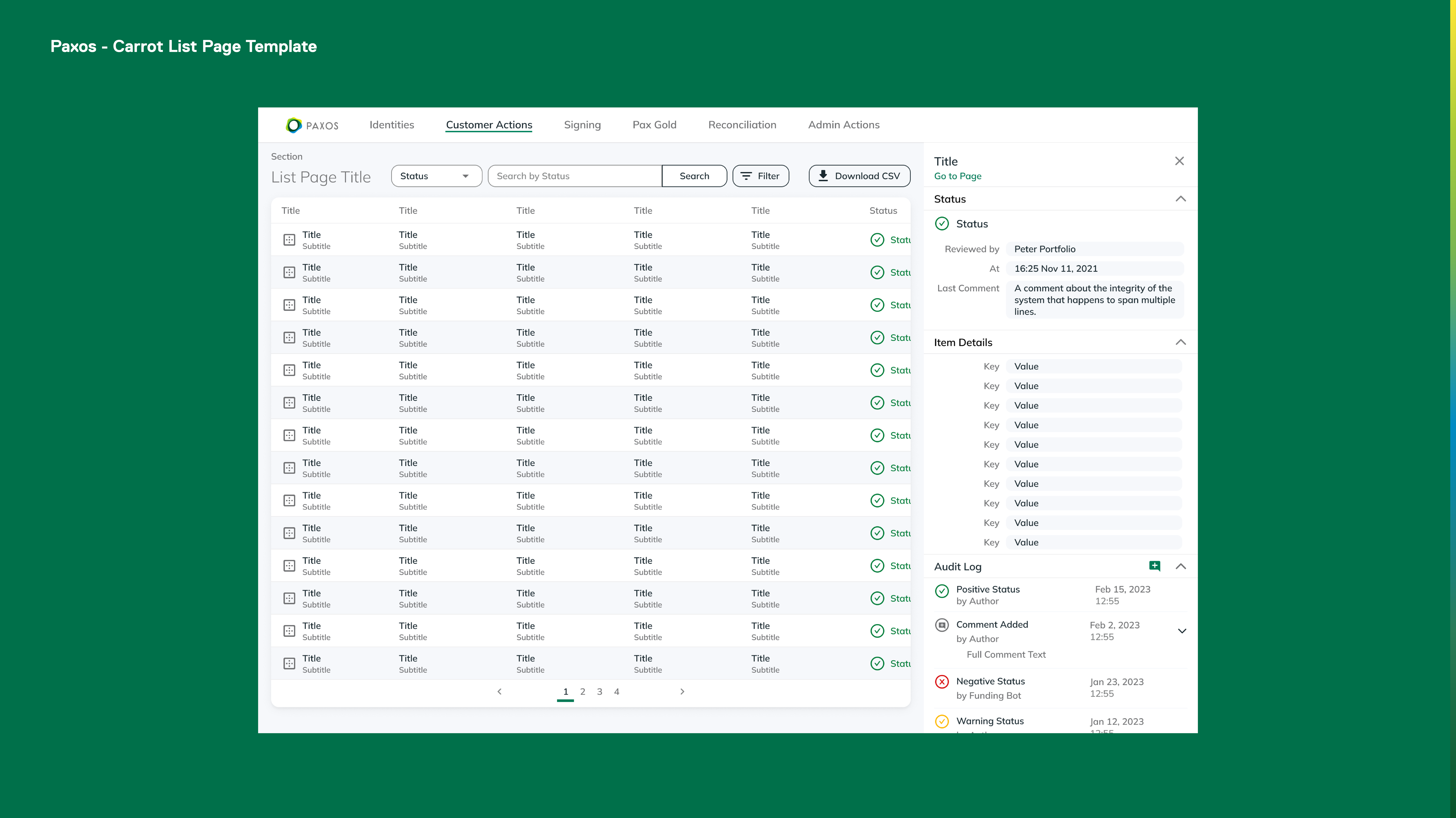
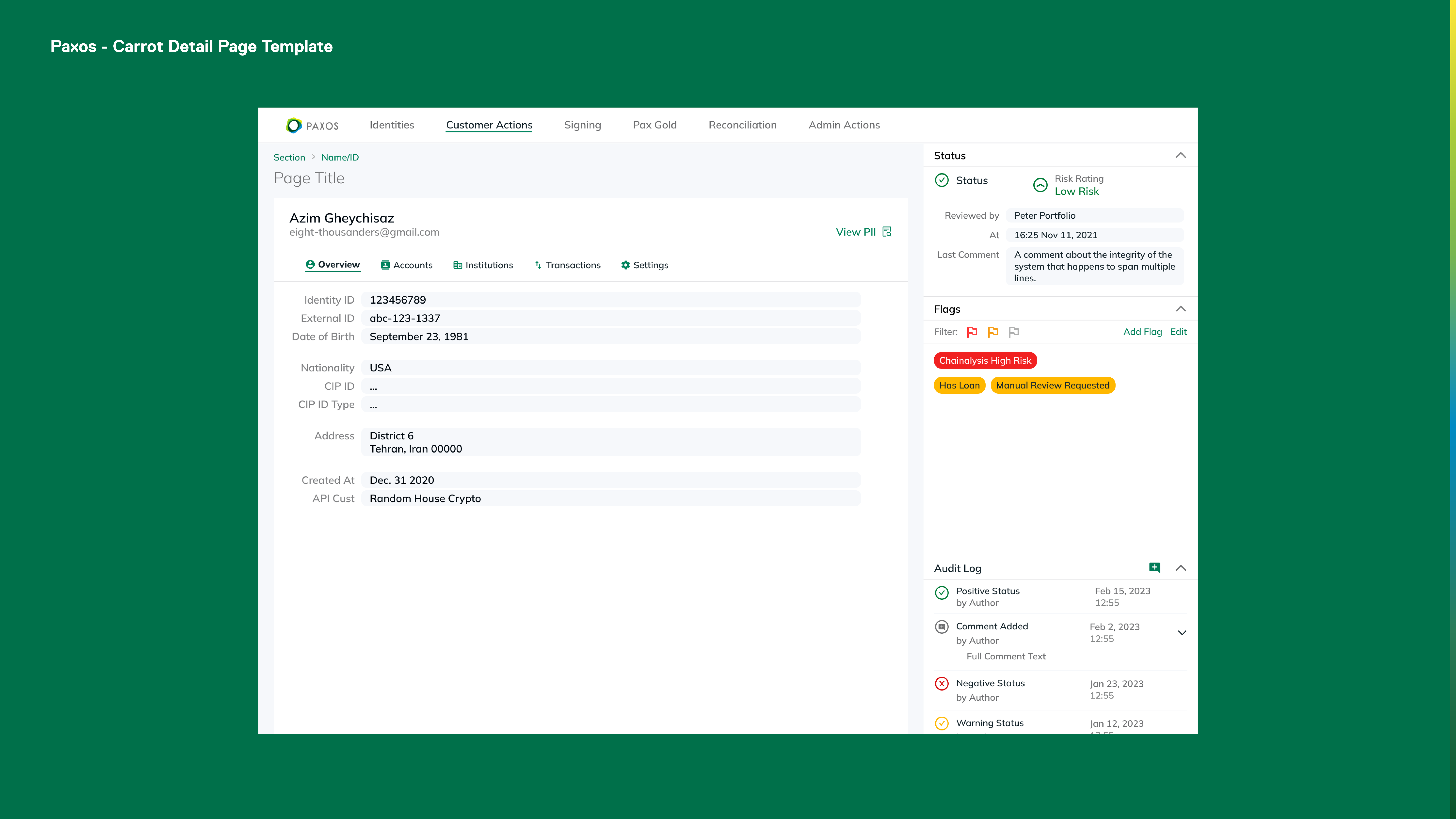
As a whole, Carrot was a huge success. We saw a 70% reduction in time to implement interfaces, a notable increase in both engineer and user satisfaction, and a 17% reduction in time on task for Ops and Compliance users. It's impossible to create a template system that accounts for 100% of the use-cases the company would encounter but, by covering 95% of them, the design team was able to minimize the time we spent blocking projects and we were able to focus our work on the edge-case interfaces where we would have maximum impact.

